
Minor League Baseball (MiLB) logos are more than just team symbols - they reflect local pride, history, and creativity. Unlike MLB logos, MiLB teams take bold design risks, incorporating regional themes, wildlife, and cultural elements. These logos connect deeply with their communities while offering collectors unique, affordable merchandise.
Here’s a quick look at some standout logos:
- Albuquerque Isotopes: Atomic imagery celebrates New Mexico’s nuclear history.
- Asheville Tourists: Features Mr. Moon and nods to the Blue Ridge Mountains.
- Beloit Sky Carp: A playful carp symbolizes perseverance and Wisconsin’s Rock River.
- Biloxi Shuckers: A baseball-bat-wielding oyster honors Gulf Coast seafood heritage.
- Carolina Mudcats: A quirky catfish swimming through the letter "C."
- Chattanooga Lookouts: Watchful eyes inside a "C" pay homage to Lookout Mountain.
- Corpus Christi Hooks: Redesigned in 2025, inspired by bayfront structures and local industries.
- Daytona Tortugas: A vibrant sea turtle with baseball stitching on its shell.
- Durham Bulls: A charging bull reflects Durham’s tobacco history.
- Eugene Emeralds: A Sasquatch-themed logo ties to Pacific Northwest folklore.
- Everett AquaSox: A frog mascot celebrates the rainy Northwest.
- Fort Wayne TinCaps: An apple logo honors Johnny Appleseed’s legacy.
- Hickory Crawdads: A bold crawdad breaking through water represents North Carolina.
- Jacksonville Jumbo Shrimp: A shrimp in motion symbolizes Florida’s coastal culture.
- Lansing Lugnuts: A lugnut mascot reflects Lansing’s automotive history.
- Lehigh Valley IronPigs: Pig iron imagery celebrates Pennsylvania’s steelmaking roots.
- Montgomery Biscuits: A biscuit mascot with googly eyes embodies Southern charm.
- Norfolk Tides: A seahorse with a trident highlights Chesapeake Bay’s maritime ties.
- Pensacola Blue Wahoos: A sleek wahoo fish symbolizes Gulf Coast fishing.
- Richmond Flying Squirrels: A flying squirrel mid-glide connects to Virginia’s natural beauty.
These logos aren’t just about aesthetics - they tell stories of their regions and resonate with fans. Whether it’s a biscuit mascot or a charging bull, each design offers a unique glimpse into what makes MiLB special.
Top 20 BEST MiLB Copa de la Diversión Logos (2022)
1. Albuquerque Isotopes
The Albuquerque Isotopes logo is a clever mix of atomic imagery and classic baseball aesthetics, perfectly reflecting the team's playful and distinctive personality. Let’s dive into its design, storytelling, and connection to the local area.
Design Creativity
At first glance, the logo grabs attention with its atomic-inspired design. The retro-futuristic font used for the team name adds a unique twist, while the bold and dynamic color scheme ensures it’s both eye-catching and memorable.
Storytelling Elements
This logo does more than just look good - it tells a story. By blending subtle pop culture references with nods to baseball tradition, it creates a design that’s fresh yet rooted in familiar themes.
Cultural or Regional Significance
The logo also carries a deeper meaning, paying homage to New Mexico's history in nuclear research. It’s a thoughtful nod to the region's scientific legacy, tying the team to its local roots in a meaningful way.
2. Asheville Tourists
The Asheville Tourists logo, designed by Plan B Branding, offers a thoughtful mix of local history, natural beauty, and baseball tradition. It’s a great example of how a sports identity can go beyond just a name or mascot to tell a story.
Design Creativity
The primary logo showcases a home run ball soaring over the iconic Blue Ridge Mountains, blending the excitement of baseball with Asheville’s breathtaking scenery. The "ball going over the moon" imagery cleverly nods to both a towering home run and the team’s Moonshiner roots.
A custom craftsman-style typeface adds a regional touch, while Mr. Moon - the team’s playful mascot - brings character to the design. Whether he’s glowing on a cap or depicted as a full-body figure with a hobo briefcase, Mr. Moon makes the logo instantly memorable. These choices weave a story that’s as rich as Asheville’s heritage.
Storytelling Elements
The logo draws on the team’s Moonshiner past, tying together history and fun. The McCormick Field logo, shaped like home plate and featuring stars and a crescent moon, further celebrates Asheville’s baseball legacy. Together, these elements create a visual narrative that feels rooted in both the game and the region.
Regional Significance
Beyond its creative design, the logo reflects Asheville’s unique character and traditions. Brian DeWine, President of the Tourists, highlighted how important it was to involve the community in the design process:
"We're extremely excited to introduce our new identity program. During the 2010 season, we formed a working relationship with Plan B Branding and proceeded to meet with fans and other members of the community to try to incorporate a true local feel to what we were trying to accomplish. Plan B did a great job of putting everything together and developing the unique concept."
– Brian DeWine, President of the Tourists and DeWine Seeds Silver Dollar Baseball
The craftsman-style typography reflects Asheville’s artisan roots and architectural traditions, giving the logo a sense of place. It honors the area’s history, from its moonshining past to its love of baseball, while celebrating the Appalachian spirit.
DeWine summed up the vision behind the logo:
"Our number one goal was to create an exciting new look for our fans and the community that they will be proud to wear."
– Brian DeWine, President of the Tourists and DeWine Seeds Silver Dollar Baseball
The result is more than just a logo - it’s a symbol of pride that connects the team to Asheville’s mountain culture and its fans, blending sports and local identity seamlessly.
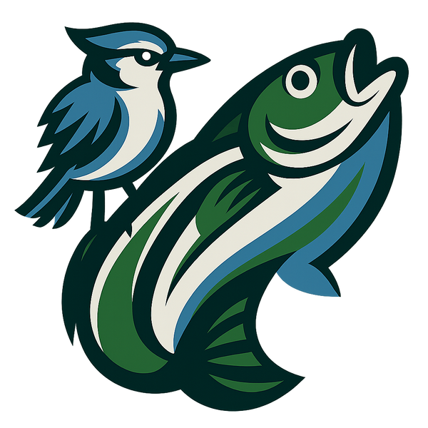
3. Beloit Sky Carp
The Beloit Sky Carp logo is a standout in Minor League Baseball, offering a bold and unconventional take on team branding. When the team transitioned from the Snappers in 2021, they embraced a name and identity that immediately grabbed attention and sparked curiosity.
A Bold and Playful Design
The Sky Carp logo showcases a colorful, cartoon-style carp leaping through the air, with baseball stitching cleverly woven into its design. The fish's expression is both playful and determined, brought to life with vibrant orange and blue tones. The modern typography complements the mascot's lively energy, creating a balance between fun and professionalism.
What sets this logo apart is its refusal to conform to traditional sports branding. Instead of trying to make the carp look fierce or intimidating, the design leans into the fish's natural charm. This unexpected approach makes the logo memorable and refreshingly different in a field often dominated by aggressive mascots. It’s a design that isn’t afraid to embrace its quirks, which ties seamlessly into a deeper narrative.
A Story That Inspires
The Sky Carp name carries a deeper meaning of transformation and ambition. Carp are known for their leaping ability, a trait that symbolizes perseverance and progress. This metaphor aligns with the team’s journey and the dedication of its fans. It’s a visual and symbolic nod to the players striving for success and the unwavering support of the Beloit community.
A Nod to Local Roots
The logo also reflects Beloit’s connection to its surroundings. Situated along Wisconsin’s Rock River, carp are a familiar sight in the area. By choosing this local fish as their mascot, the team pays homage to the region’s natural environment and traditions.
Beyond that, the rebrand captures Wisconsin’s spirit of embracing the unconventional. Known for its quirky traditions and unique celebrations, the state’s personality shines through in the Sky Carp branding. It’s a celebration of the ordinary turned extraordinary, perfectly encapsulating the area’s character.
Nature Meets Whimsy
The Sky Carp design is deeply rooted in Wisconsin’s natural heritage, offering a fresh perspective on aquatic themes. While most fish-themed sports logos focus on predators like sharks or barracudas, this one champions a more humble species. The design skillfully incorporates the carp’s scales and fins while adding baseball-specific touches like stitching patterns. It’s a blend of natural detail and playful creativity that feels both authentic and imaginative.
4. Biloxi Shuckers
The Biloxi Shuckers logo brings the lively vibe of the Mississippi Gulf Coast to life while celebrating the area's deep seafood roots. It's a standout emblem in the world of Minor League Baseball.
A Playful and Clever Design
At the heart of the logo is a cartoon oyster gripping a baseball bat, giving the team a fun and approachable mascot. The mix of bold, classic typography with sleek, modern graphics ensures the design feels both nostalgic and fresh. It’s more than just a logo - it’s a nod to the local community and its traditions.
Honoring Local Heritage
This design isn’t just about baseball; it’s a tribute to Biloxi’s seafood legacy and its easygoing coastal lifestyle. By incorporating these elements, the logo becomes a symbol of the area's identity and pride.
A Splash of Coastal Inspiration
The color scheme - featuring soft blues and greens - draws from the hues of Biloxi’s waters. These subtle touches tie the design back to the region’s maritime surroundings, grounding it in the natural beauty of the Gulf Coast.
5. Carolina Mudcats
The Carolina Mudcats logo stands out as a trailblazer in Minor League Baseball, setting the tone for creative and eye-catching team branding. This quirky catfish design not only embodies the team’s identity but also redefined how sports logos could connect with fans.
Design Creativity
The logo’s creation was a quick yet impactful process. Artist Frank Harrod designed it in less than 90 minutes, crafting a look that became instantly recognizable in minor league sports. The design features a catfish swimming through the letter "C", complete with droopy eyes, long whiskers, and a playful grin that gives it a friendly, approachable vibe.
A small but thoughtful tweak - a curved tail - added a sense of motion to the design. Team owner Steve Bryant explained:
"The first rendition just had the catfish head and the C. When we added the tail, it gave that whole logo some movement, so it looked like the catfish, which tend to swim side to side, was sort of meandering through the C."
This little adjustment brought the logo to life, making it dynamic and memorable.
Storytelling Elements
The Mudcats logo didn’t just look good - it told a story. It marked a shift in sports branding, as Bryant proudly recalled:
"We were the first to ignite the logo craze, turning a quirky name into an iconic design."
This pioneering approach inspired other teams to embrace bold and fun identities, paving the way for fan-favorites like the Rocket City Trash Pandas and Hartford Yard Goats. Its appeal even reached global icons, with the logo being worn by Muhammad Ali, former President George W. Bush, and making a cameo in Space Jam.
Cultural or Regional Significance
The logo’s connection to the region is just as strong as its design. The mudcat - a type of catfish - is known for being a tough and scrappy fighter, traits that resonate with the local community. Found in the muddy waters of lagoons and ponds, this fish symbolizes the area's deep ties to fishing traditions and waterways.
The financial success of the logo has been equally impressive. Frank Harrod was paid $500 for his work, but over the past 30 years, the design has generated tens of millions in merchandise sales. The team remains a top seller in minor league merchandise, with hats flying off the shelves during their debut season and beyond.
6. Chattanooga Lookouts
The Chattanooga Lookouts logo is a perfect example of simplicity meeting creativity. It features a pair of watchful eyes cleverly nestled within the classic "C" for Chattanooga, making it instantly recognizable.
Design Creativity
The brilliance of the Lookouts logo lies in its ability to tell a story through design. Larry Ward, the longtime radio voice for the Lookouts, explained its origin:
"It came out of a straightforward line of thought. Chattanooga's team had long sported a 'C' on its caps and uniforms. How to capture the spirit, concept and history of the name 'Lookouts?' Eyes."
Rather than reinventing the wheel, the designers enhanced the existing "C" with an imaginative twist. The addition of the eyes not only modernized the logo but also gave it a personality that fans could instantly connect with. Ward elaborated on the design's impact:
"With the big 'C' as the head and the eyes, it tells you exactly what it is: the Chattanooga Lookouts."
This approach bridges tradition and innovation, making the logo both memorable and meaningful. By blending the team's history with a fresh visual element, the logo stands out while paying homage to its roots.
Cultural or Regional Significance
The Lookouts logo carries a deep connection to the region's history and geography. The team name itself is a nod to Lookout Mountain, a prominent natural landmark that stretches across Alabama, Georgia, and Tennessee.
The word "Chattanooga" originates from the Creek language and translates to "Lookout Mountain", further tying the team to its surroundings. Alex Tainsh, the team's Marketing and Promotions Manager, highlighted this link:
"The simple answer to this question is that the team is named for nearby Lookout Mountain, which dominates the landscape just over the Tennessee-Georgia border."
The concept of "looking out" has long been a part of the area's identity. Early travelers were warned to "look out" for the mountain's rugged features, while the Cherokee referred to the region with names meaning "two mountains looking at each other". Additionally, Lookout Mountain played a pivotal role in the Civil War during the 1863 "battle above the clouds".
This historical and geographical significance gives the logo a timeless appeal. As Tainsh noted:
"But I think the reason it's still popular today is that it still has that history behind it."
7. Corpus Christi Hooks
The Corpus Christi Hooks revealed a fresh logo redesign on January 31, 2025, marking a significant shift in their visual identity. This new look manages to honor the team’s history while blending in modern design elements that celebrate the essence of the local community.
A Thoughtful Design
The updated Hooks logo is anything but ordinary. Instead of sticking to a straightforward hook symbol, the design takes a more intricate and meaningful approach.
At the heart of the logo is a shape inspired by the eight bayfront miradors - gazebo-like structures that line Corpus Christi’s waterfront. This architectural detail gives the logo a distinctive silhouette, breaking away from the typical style seen in baseball logos. Above this mirador-inspired design is the "Hooks" wordmark, framed by a half-circle of eight stars, which mirror the city’s eight miradors.
Adding to its uniqueness, the logo features an outline of Texas with a hook pinpointing Corpus Christi’s location. This subtle yet striking detail ties the design to the region, blending geographic pride with visual appeal.
Brady Ballard, the Hooks’ General Manager, highlighted the originality of the project, stating:
"We are very fortunate to say this, that the entirety of this [logo design] is an in-house Corpus Christi Hooks organization project."
The redesign was spearheaded by Courtney Gatlin, the team’s senior manager of creative services. One standout alternate cap design spells "Hooks" clockwise around the five points of a star, a nod to an early Texas state flag. This thoughtful approach to design breathes new life into the team’s identity while telling a deeper story.
A Logo That Tells a Story
Beyond its striking appearance, the logo is packed with meaning. The eight stars symbolize the key industries driving Corpus Christi’s economy: agriculture, commerce, oil, chemical, grain, seafood and fishing, metal refining, and tourism.
This makes the logo more than just a team emblem - it’s a representation of the city’s identity. The team name, "Hooks", ties everything together, celebrating the city’s bayside location and its deep-rooted fishing culture. It’s a perfect blend of sport and local heritage.
An alternate jersey design, dubbed the "Sparkling City" jersey, adds another layer of storytelling by referencing Corpus Christi’s nickname, "Sparkling City by the Sea." This thoughtful detail creates yet another way for fans to feel connected to their team.
A Tribute to Local Pride
The Hooks logo is more than a design - it’s a tribute to South Texas culture and geography. The inclusion of the Texas state outline with Corpus Christi marked prominently reinforces a sense of regional pride.
Ballard elaborated on the connection between the logo and the city’s heritage:
"It is, in a sense, a modernization, but with many nods to our 20-year history and our relationship to the city. We speak to it in our primary logo, shaped from our Corpus Christi bayfront miradors."
The alternate cap’s reference to an early Texas state flag adds a historical dimension, linking the team to the broader history of the Lone Star State while keeping the focus on its local roots.
A Subtle Nod to Nature
While the logo doesn’t include direct animal imagery, it draws heavily from the natural marine environment that defines Corpus Christi. The team name itself, "Hooks", is a clear nod to fishing, reflecting the Gulf Coast’s thriving fishing industry and marine life.
By highlighting "seafood and fishing" as one of the city’s economic pillars, the logo strengthens its connection to the local environment. The mirador-inspired design further reinforces this link, symbolizing the team’s connection to the coastal ecosystem that shapes both the economy and recreational life in the area.
This thoughtful integration of natural and cultural elements makes the Hooks’ logo a fitting tribute to Corpus Christi’s rich heritage.
8. Daytona Tortugas
The Daytona Tortugas boast one of Minor League Baseball's most eye-catching and imaginative logos, perfectly capturing the coastal essence of their Florida home.
A Bold and Dynamic Design
The Tortugas logo immediately grabs attention with its lively tropical colors and striking turtle imagery. At its heart is a sea turtle, brought to life in vivid orange and teal tones that echo the vibrant spirit of Florida's coastline. A clever touch is the baseball stitching integrated into the turtle's shell, seamlessly tying the sport to the team's mascot.
This design strikes a balance between fun and fierce. The turtle is portrayed in an action-packed pose with determined eyes, radiating energy and strength. The intricate shell pattern adds depth while reinforcing the baseball connection. The wordmark "Tortugas" is written in a custom typeface with smooth, flowing curves that harmonize with the organic shapes of the turtle, creating a unified and visually engaging logo.
Deep Regional Roots
The name "Tortugas", Spanish for "turtles", highlights the team's coastal identity. The vibrant color palette - featuring warm oranges and cool teals - draws inspiration from Florida's stunning natural scenery, from its glowing sunsets to its sparkling waters, solidifying the logo's ties to the region.
A Tribute to Florida's Wildlife
Sea turtles are a symbol of Florida's coast, where species like loggerheads return annually to nest on its beaches. The Tortugas logo honors these graceful creatures, emphasizing their unique characteristics. The turtle's flippers are shown in motion, and its raised head suggests activity and vitality, while the teal and orange hues evoke the beauty of Florida's waters and skies. This nature-inspired design perfectly captures the essence of its namesake and the region it represents.
9. Durham Bulls
The Durham Bulls boast one of Minor League Baseball's most recognizable logos, blending a powerful design with deep regional connections.
Design Creativity
At the heart of the logo is a fierce black bull charging through a stylized "D." Its aggressive stance and the bronze steam trailing behind it convey raw energy and a competitive edge. The bold color palette, with the black bull standing out against lighter backgrounds and bronze accents adding depth, creates a striking visual statement. This design isn't just eye-catching - it tells a story rooted in history.
Storytelling Elements
The bull imagery draws inspiration from the 19th-century "Bull Durham Smoking Tobacco" brand, which itself was named after a Durham shorthorn from England. This connection ties the team's modern identity to a blend of English agricultural heritage and American tobacco history. It’s a nod to the past, woven into the present.
Regional Significance
The bull has been a symbol of Durham since the late 1800s, earning the city its nickname, "Bull City". The logo’s bold design reflects the area's resilience and community spirit. The team further embraces local culture with their alternate identity for "Copa de la Diversión", known as "Toros Bravos de Durham." This version features a snorting bull inspired by Mexican sugar skull art and incorporates the city’s flag colors, celebrating Durham's cultural diversity. Downtown, a 10-foot bronze statue named "Major" stands as a testament to the bull’s enduring presence in the city’s identity.
Wildlife and Nature Motifs
The bull serves as a powerful emblem of strength, determination, and unity. Its muscular frame, flared nostrils, and lowered head suggest unstoppable momentum. This theme is carried through by the team mascot, Wool E. Bull, and the iconic "snorting bull sign" above the outfield wall. Originally a movie prop, this sign has become a permanent and beloved feature of the ballpark, further embedding the bull into the team’s lore and fan culture.
10. Eugene Emeralds
In November 2012, the Eugene Emeralds made history as the first professional sports team to embrace a Sasquatch logo. This daring rebranding not only gave the team a fresh identity but also made them stand out in the world of Minor League Baseball.
Bold Design Choices
The centerpiece of the logo features a Sasquatch pulling trees out of the ground behind the bold "Emeralds" lettering. Additional details include an "E" shaped like a Sasquatch footprint and other creative marks. Their home hats display Sasquatch biting into a tree, while the road uniforms feature the word "Eugene" with Sasquatch feet on either end. The team also introduced a striking color palette of Neon Green, Emerald Green, and Sasquatch Black, perfectly capturing the mythical and natural essence of the region.
A Nod to Local Lore
The Sasquatch theme taps into the rich folklore of the Pacific Northwest, reflecting the mysterious charm of the area's dense forests. As Ems General Manager Allan Benavides explained:
"Ultimately, we felt that sasquatch was the best fit to represent the mystique of the Northwest woodlands."
The design also connects with Eugene's free-spirited vibe. Jason Klein, Partner at Brandiose, noted:
"Eugene is a hotbed of countercultural ideas. From Sasquatch sightings to hippy culture, the Ems are honoring Eugene's eccentricities with a few of their own."
Weaving Mythology into the Brand
This rebranding effort created a unique identity that blends local legends with the team's personality. It has also opened up new opportunities for merchandise and branding that celebrate both the sport of baseball and the folklore of the Pacific Northwest.
11. Everett AquaSox
The Everett AquaSox have crafted a brand that celebrates local wildlife while paying homage to their Major League Baseball parent club. Their logo collection demonstrates how thoughtful design can honor both regional identity and organizational heritage. This balance has become the cornerstone of the AquaSox's visual identity.
Nature-Inspired or Wildlife Motifs
At the heart of the AquaSox brand is their primary frog logo, a symbol that perfectly reflects the Pacific Northwest’s rainy climate. Pat Dillon, the team's radio broadcaster, explained the mascot's natural connection:
"The frog was chosen for its natural fit with the rainy Northwest."
The design itself blends elements of a Pacific tree frog and a Central American red-eyed tree frog, with a playful nod to baseball legend Brooks Robinson. As Dillon put it:
"The frog is a cross between a Pacific tree frog and a Central American red-eyed tree frog - and Brooks Robinson."
This hybrid design not only captures the local environment but also creates a visually striking emblem that resonates with fans and is a hit on merchandise.
Design Creativity
The AquaSox have gone beyond their iconic frog logo to introduce two clever secondary designs. One reimagines the Seattle Mariners' historical trident logo, originally shaped as an "M." By rotating it 90 degrees, the trident transforms into an "E" for Everett. This subtle yet creative adaptation ties the AquaSox to their parent club while giving the symbol a fresh, local twist.
Another secondary logo features aqua-colored socks, a playful nod to the classic Boston Red Sox logo. But the AquaSox didn’t stop there - they added a unique touch by incorporating frog toes into the design. As Dillon explained:
"To put our own spin on it, we put the frog toes in there."
These inventive designs highlight the team’s ability to blend tradition with originality, keeping their identity fresh and engaging.
Regional Significance
With Everett receiving about 49 inches of rain annually - 30% more than the national average - the amphibian mascot feels like a perfect representation of the local climate. The choice of a frog not only reflects the region’s weather but also connects the team to the natural surroundings that define the Pacific Northwest.
Storytelling Elements
Tom Backemeyer, the AquaSox's executive vice president, emphasized the importance of balancing their unique identity with a connection to the Mariners:
"It's an extension of the brand. It's an enhanced look and a tie-in with the Mariners. The Mariners helped through the process."
This layered approach to branding allows the AquaSox to celebrate their local roots while strengthening ties to their Major League affiliate. By reinterpreting historical design elements and incorporating regional and wildlife themes, the team has created a visual identity that is both meaningful and memorable.
sbb-itb-d0a8c9d
12. Fort Wayne TinCaps
The Fort Wayne TinCaps have one of the most talked-about logos in Minor League Baseball. With its apple-themed design, the logo blends local history and bold artistry, creating a design that’s as unconventional as it is memorable.
Storytelling Elements
The logo pays homage to Johnny Appleseed, also known as John Chapman, a folk hero buried in Fort Wayne who famously planted apple orchards across the frontier. The team name combines his apple legacy with the "tin" element, resulting in a clever and distinct identity. This historical connection sets the stage for the logo's creative execution.
Design Creativity
The apple character in the logo sports a mischievous grin and is paired with tin-style lettering that gives off a comic book vibe. Kevin Michael Wyatt captured the essence of this design perfectly when he said:
"That smile says 'Yeah, I was with your girlfriend last night, what are you gonna do about it?' and the lettering looks like it would be in a Crimson Chin comic book if such thing existed."
This playful typography and cheeky attitude give the logo an edge that’s hard to ignore.
Cultural or Regional Significance
By honoring Johnny Appleseed, the logo firmly roots itself in Fort Wayne’s heritage, celebrating an iconic figure deeply tied to Indiana’s history.
Nature-Inspired or Wildlife Motifs
The apple, a simple yet powerful symbol of Johnny Appleseed’s legacy, is transformed into a bold and unforgettable centerpiece for the TinCaps’ identity.
13. Hickory Crawdads
The Hickory Crawdads logo turns a simple freshwater crawdad into a fierce and commanding mascot, blending regional pride with a competitive athletic spirit - a hallmark of many MiLB team designs.
A Fresh Take on Design
In 2016, Studio Simon gave the Crawdads a bold new look, creating an identity system that extended far beyond a single logo. The main logo now features a crawdad with piercing red eyes and powerful claws breaking through blue water, introducing a custom shade called 'Crawdads Blue' alongside the team's signature red and black colors.
To complement the primary logo, alternate designs were added. These include a crawdad gripping crossed baseball bats and a claw pinching a star over the outline of North Carolina. This cohesive branding system provides the team with flexible options for merchandise, marketing, and more, while reinforcing its ties to the local community.
Building a Story
The redesign wasn’t just about aesthetics - it was about telling a story. The alternate logos, such as the crawdad with bats and the claw over North Carolina, add layers to the Crawdads' identity. The aggressive stance of the main logo conveys the team's competitive spirit, while the regional elements highlight the pride and connection to their home state.
A Nod to Local Heritage
The Crawdads logo goes beyond sports, tapping into North Carolina’s traditions. Crawdads are a staple in local cuisine and culture, making them a natural choice for a mascot. The alternate logo featuring a claw pinching a star over the state outline ties the team directly to North Carolina pride, resonating with fans who value their Southern roots.
Inspired by Nature
Drawing from its aquatic origins, the Crawdads logo incorporates elements of wildlife. The claws breaking through blue water reflect the crawdad’s natural habitat and emphasize its strength. With vivid red eyes and bold claws, the design transforms a small creature into a striking symbol of power and determination, leaving a lasting impression.
14. Jacksonville Jumbo Shrimp
The Jacksonville Jumbo Shrimp logo combines a playful shrimp design with baseball elements, creating a symbol that works perfectly across a variety of merchandise.
Design Details
The main logo shows a shrimp in motion, cleverly integrated with baseball features. Variations, like a shrimp sporting a cap or paired with crossed bats, expand its usability for different merchandise. This smart design adds both charm and flexibility, making it a standout for fans and collectors alike.
Local Connection
As with many Minor League Baseball (MiLB) logos, the Jacksonville Jumbo Shrimp emblem reflects the community’s character. It draws inspiration from Jacksonville's seafood-rich culture and its coastal way of life. Situated on Florida's Atlantic coast, Jacksonville’s maritime heritage makes the shrimp an ideal and meaningful symbol for the city.
Inspired by Nature
The logo also highlights the shrimp’s natural form, emphasizing its curved body and long antennae. These design elements create a sense of movement and energy, symbolizing both the vibrancy of Jacksonville’s environment and the excitement of the game.
15. Lansing Lugnuts
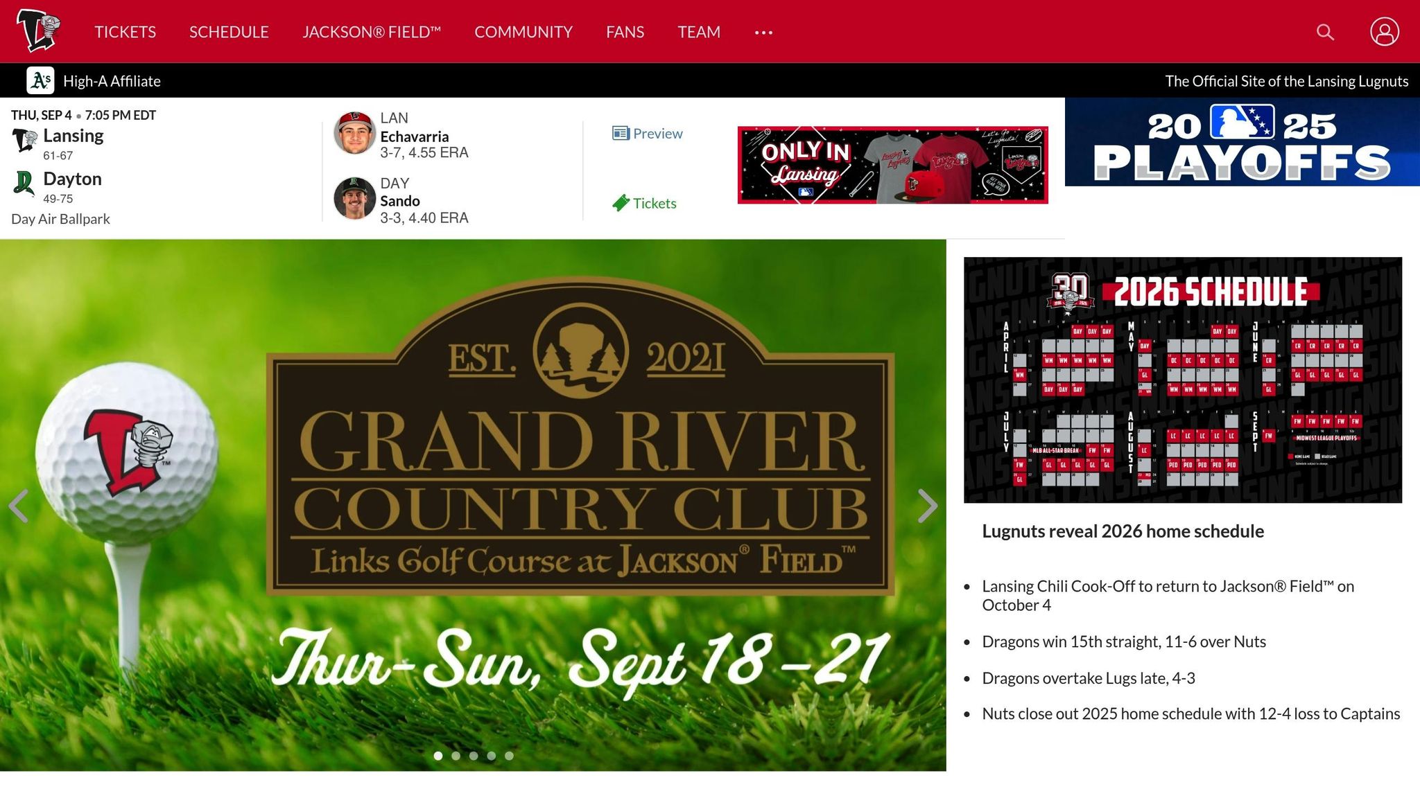
The Lansing Lugnuts logo is a standout in Minor League Baseball, blending industrial charm with a quirky, unforgettable personality. While many teams lean toward fierce or friendly mascots, the Lugnuts took a different route with "Luggy the Lugnut", creating a unique identity that’s hard to miss.
Design Creativity
This logo doesn’t follow the usual playbook for mascot design. Instead, it features Luggy the Lugnut - a dizzy, offbeat character that’s more bolt than nut. The team even pokes fun at this detail with their team store name, "Nuts and Bolts". Luggy’s goofy expression appeals to fans of all ages, giving the logo a playful and approachable vibe. Though the overall identity has stayed consistent, the team added a fresh twist in 2004 by updating the "L" in their wordmark. This creative design adds a layer of fun that enhances the excitement of game day.
Storytelling Elements
Luggy’s wobbly, wide-eyed expression captures the lighthearted atmosphere of a day at the ballpark while nodding to Lansing’s industrial history. The character’s design weaves together fun and nostalgia, creating a narrative that connects the team to its community and its roots.
Cultural or Regional Significance
Beyond its playful appearance, the logo is a tribute to Lansing’s industrial heritage, particularly its ties to the automotive industry. Lansing was once home to Oldsmobile, which produced over 14 million cars in the city. The lugnut - a small but essential car part - symbolizes the city’s role in keeping the wheels of the automotive world turning. By embracing a quirky nickname and a regionally meaningful logo, the Lugnuts helped set a trend for family-friendly branding in Minor League Baseball.
16. Lehigh Valley IronPigs
The Lehigh Valley IronPigs logo is more than just a symbol for a Minor League Baseball team; it's a tribute to the industrial heritage, local folklore, and history of Pennsylvania's Lehigh Valley. By using multiple logo variations, the IronPigs tell a rich, layered story about the region, creating a visual narrative that resonates with both locals and baseball fans.
Design Creativity
One of the standout designs is the Molten Red IronPigs cap logo, which appears to drip with liquid metal. This striking detail reflects the fiery process of forging pig iron in blast furnaces - a nod to the area's steelmaking legacy.
Another creative variation is the Sunday cap, which features a Liberty Bell suspended by an I-beam. The I-beam, complete with rivets, highlights the region's steel industry roots.
On Saturdays, the team’s uniforms take inspiration from Pennsylvania Dutch hex signs, traditional symbols used by local farmers. These designs add a folkloric touch to the IronPigs’ visual identity.
Cultural or Regional Significance
The team’s name itself pays homage to pig iron, the raw material essential to steel production - a cornerstone of the Lehigh Valley's industrial fame. The black jerseys, accented with chrome lettering and numbers, honor Bethlehem Steel Corp. and other historic blast furnaces. These jerseys also remind fans of the steel that helped build iconic structures like the Golden Gate Bridge and the Empire State Building.
The Liberty Bell design carries even more historical weight. During the Revolutionary War, the Liberty Bell was hidden in Allentown in 1777 to protect it from being melted down by British forces. The Saturday uniforms' custom hex sign also tells a regional story. Divided into four sections, it features crossed bats framing a baseball. One section includes a pig, representing both the team and Coca-Cola Park, while the others honor the cities of Allentown, Bethlehem, and Easton.
Storytelling Elements
Each design element in the IronPigs’ branding tells a piece of the Lehigh Valley’s story. The molten iron imagery reflects the region's industrial might and the intense conditions of steel production. The Pennsylvania Dutch hex signs connect to local folklore, symbolizing protection and community pride. Together, these thoughtful details celebrate the area’s industrial roots and cultural identity, making the IronPigs’ logos a meaningful tribute to their home.
17. Montgomery Biscuits
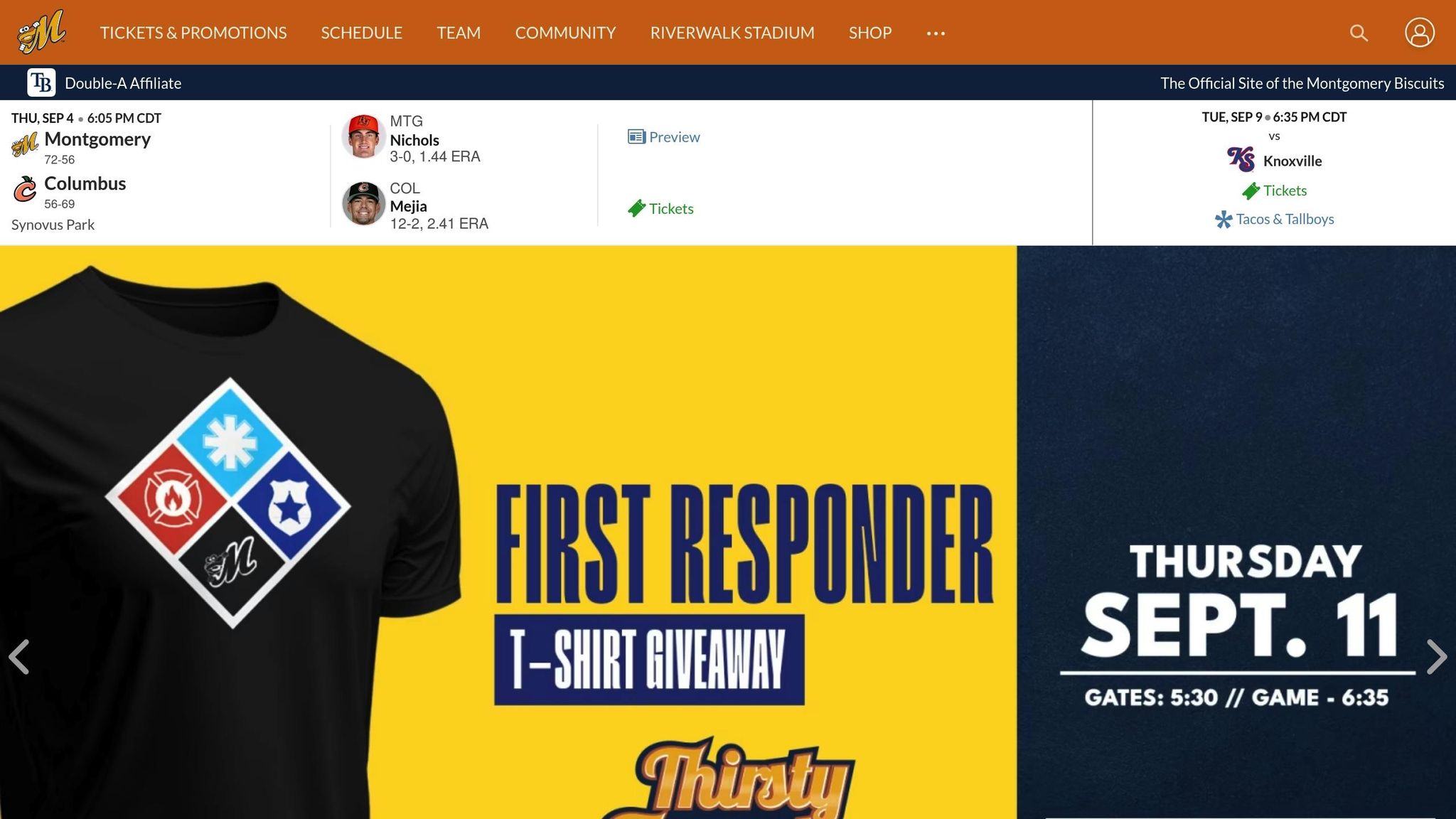
The Montgomery Biscuits logo holds the top spot as the #1 Minor League Baseball logo. This Alabama-based team's branding pays homage to the beloved traditions of Southern cuisine and hospitality, striking a chord with fans nationwide.
Design Creativity
The Biscuits logo transforms a humble biscuit into a lively, engaging mascot. With its googly eyes, a buttered tongue, and cartoonish gloves, the design oozes personality and charm. The biscuit's wide-eyed expression, full of quirky vulnerability, makes it impossible not to smile at its whimsical appeal.
What makes this logo stand out is its mix of humor and absurdity. It’s cute, it’s funny, and it’s just a little unexpected - all of which make it unforgettable. By embracing such an unconventional approach, the design captures the essence of regional charm in a way that feels authentic and fun.
Cultural or Regional Significance
At its heart, the Montgomery Biscuits logo is a love letter to Southern culture. Biscuits are more than just food in the South - they’re a symbol of comfort, tradition, and home-cooked hospitality. By choosing this as their mascot, the team connects deeply with Alabama’s roots and traditions.
The connection to local culture doesn’t stop with the logo. The team’s mascot, Big Mo, adds another layer of storytelling. Described as a “biscuit-eating, aardvarky sort of creature”, Big Mo complements the food theme while bringing even more personality to the brand. Together, the logo and mascot celebrate the spirit of the community while keeping things lighthearted and fun.
Storytelling Elements
The personified biscuit, with its wide-eyed innocence, tells a story of warmth, comfort, and a scrappy underdog spirit - qualities that resonate perfectly with a Minor League team.
This mix of playful absurdity and heartfelt charm goes beyond the typical sports logo. It transforms a simple biscuit into a character that fans can cheer for both on and off the field. The Montgomery Biscuits logo is a prime example of how Minor League Baseball teams use clever, localized imagery to create a lasting emotional connection with their audiences. It’s more than a logo - it’s a story that fans love to share.
18. Norfolk Tides
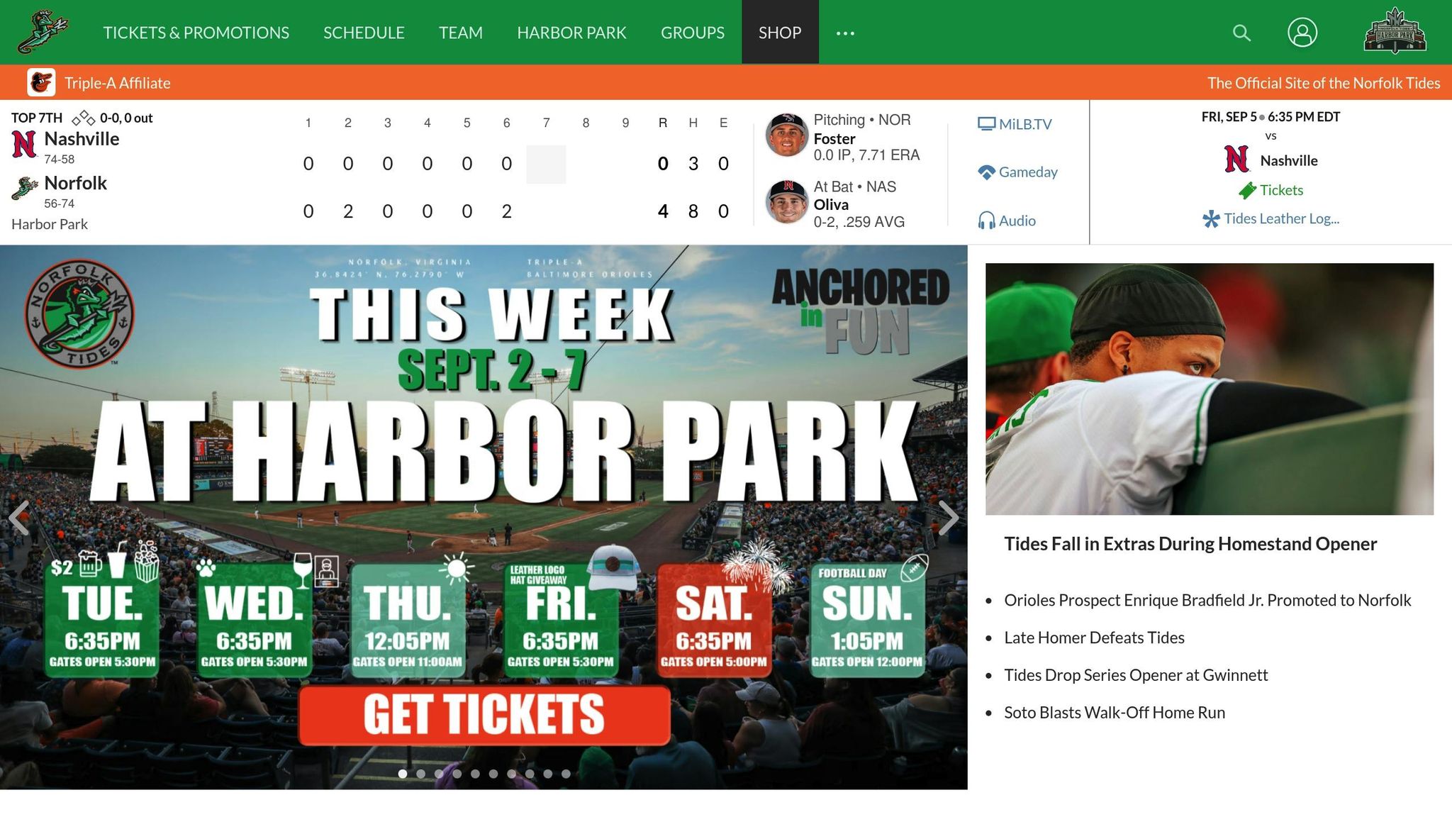
The Norfolk Tides logo is a clever blend of nautical tradition and modern design, reflecting the essence of coastal life while paying tribute to the region's maritime heritage.
Nature-Inspired or Wildlife Motifs
At the core of the Tides' branding is a striking trident-wielding seahorse, which serves as the team's primary logo. This choice is deeply tied to the local environment, as seahorses are native to the Chesapeake Bay area, which surrounds the Hampton Roads region. For the Copa de la Diversión games, the team adopts an alternate identity, "Caballitos del Mar de Norfolk" (Spanish for "Seahorse"). This version features a vibrant sugar skull-style seahorse, incorporating its spine into the wordmark for a distinctive and colorful design. This natural motif seamlessly bridges tradition and modernity, reinforcing Norfolk's maritime identity.
Design Creativity
The logo, crafted by Brandiose, includes an anchor-shaped "N", tying the design to nautical themes with a clean and recognizable symbol. The color palette - featuring "Sea Foam" and "Tidal Green" - further emphasizes the team's connection to Norfolk's coastal and maritime heritage. Meanwhile, the "Caballitos del Mar" design introduces a lively and energetic color scheme, adding a cultural vibrancy to the seahorse motif.
Cultural or Regional Significance
This logo is more than just a design - it’s a tribute to Norfolk's rich nautical, military, and shipbuilding traditions, as well as its coastal way of life. Designers worked closely with fans and community members, weaving local stories and history into the brand. The "Caballitos del Mar de Norfolk" identity, created in collaboration with the Chamber for Hispanic Progress, highlights the seahorse's significance to the environment and economy while fostering an authentic connection with the Hispanic community. These elements ground the logo in the traditions of Chesapeake Bay and Norfolk's shipbuilding legacy.
Storytelling Elements
The Norfolk Tides logo combines elements of local folklore with a modern twist, creating a design that feels both mythical and deeply connected to the region. Its contemporary style strengthens the team's identity while celebrating its roots.
19. Pensacola Blue Wahoos
The Pensacola Blue Wahoos logo grabs attention with its playful design, blending Gulf Coast maritime vibes with a modern twist.
Nature-Inspired or Wildlife Motifs
At the heart of the logo is the wahoo fish, a prized catch from the Gulf of Mexico. Known for its speed and agility, the wahoo perfectly symbolizes the energy and competitive spirit of baseball. The design showcases a sleek, stylized wahoo in motion, with bold fins and a dynamic pose that radiates action. Its blue coloring not only ties into the team’s palette but also reflects the natural hues of the Gulf waters. The wahoo’s reputation as a fierce fighter when hooked adds an extra layer of meaning, making it a fitting emblem for a team that thrives on competition.
Design Creativity
The Blue Wahoos logo strikes a balance between fun and functionality. The cartoon-like depiction of the wahoo gives it personality while keeping its features recognizable. A vibrant mix of blue and teal mirrors the Gulf’s waters, making the design pop on uniforms and merchandise. The wave-inspired typography complements the aquatic theme without being overly literal, adding a sense of flow and movement. Like many Minor League Baseball logos, this design transforms local essence into a visually engaging story.
Cultural or Regional Significance
Pensacola’s location along the Gulf Coast makes the wahoo an ideal choice for representing the community. Fishing, boating, and marine activities are deeply woven into the area’s lifestyle and economy, making the logo resonate with locals and visitors alike. The name "Blue Wahoos" is a nod to the local fishing vernacular, as anglers in the region often refer to the fish by that name. This connection strengthens the bond between the team and its fanbase, many of whom have firsthand experience with the wahoo during fishing trips. The logo not only celebrates Pensacola as a top fishing destination but also highlights the traditions and identity that define Gulf Coast life.
Storytelling Elements
The Blue Wahoos logo weaves a tale of a community where baseball and fishing come together. The playful, anthropomorphic wahoo brings marine life into the world of America’s pastime, creating a unique link between two beloved local activities. This imaginative approach appeals to families and children while maintaining a level of sophistication that attracts dedicated baseball fans and collectors. Ultimately, the logo encapsulates the spirit of Pensacola, celebrating its natural beauty, cultural heritage, and love for the game in one cohesive design.
20. Richmond Flying Squirrels
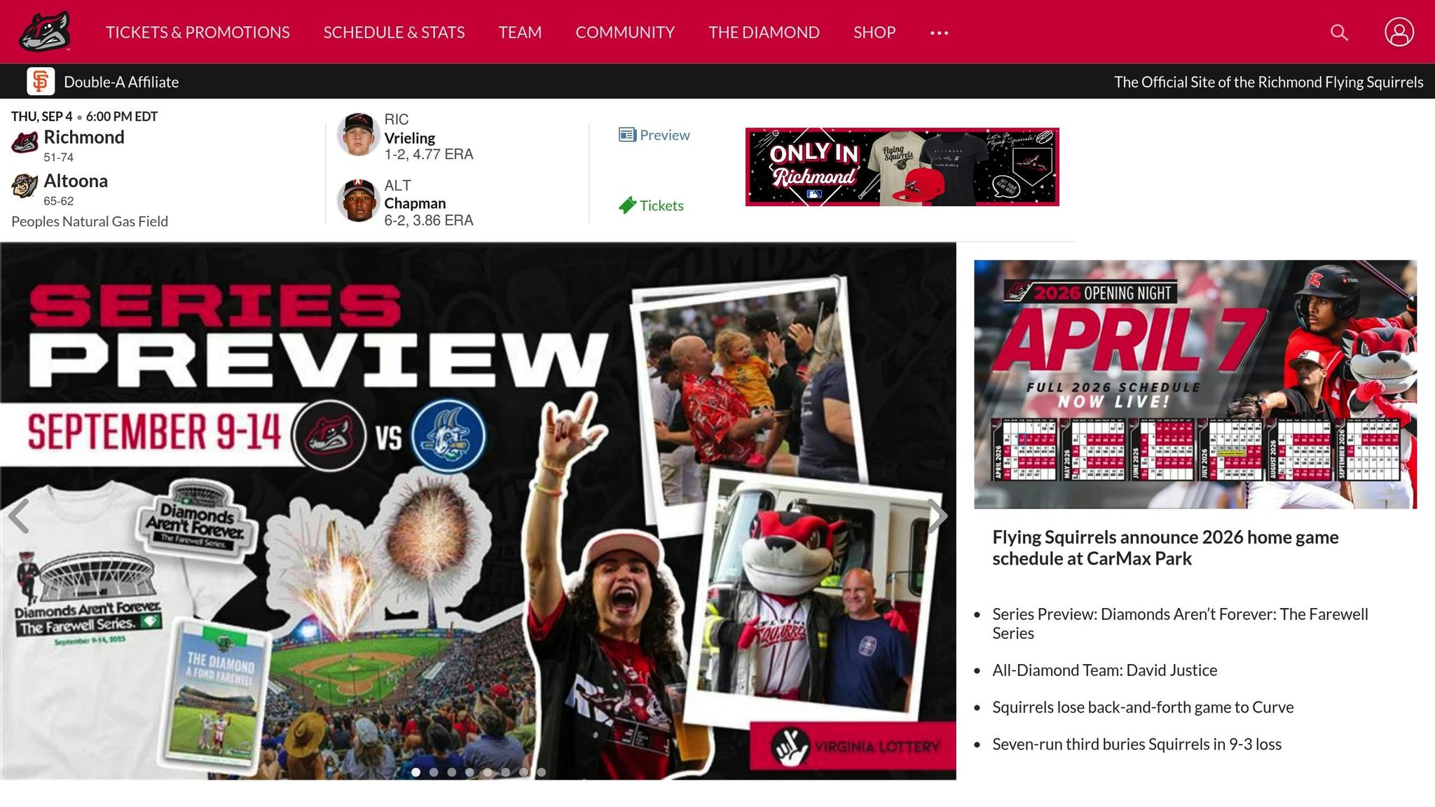
The Richmond Flying Squirrels logo is a delightful mix of playfulness and regional storytelling, making it a standout in the world of minor league baseball.
Nature-Inspired or Wildlife Motifs
At the heart of the design is a flying squirrel frozen mid-glide, its outstretched membrane capturing the essence of agility and woodland energy. A subtle acorn detail adds a touch of charm, tying the logo to the natural world while reinforcing its connection to the animal’s habitat.
Design Creativity
The Flying Squirrels logo strikes a perfect balance between being fun and slightly edgy. Todd Parnell summed it up well:
"It's kid-friendly, but has a little bit of an edge to it."
This versatility makes the logo appealing to families while also intriguing serious collectors. Its creative design has earned it notable industry recognition, including Ballpark Digest's "Logo of the Year" in 2010 and Baseball America's title of "best minor-league logo" in 2015.
Cultural or Regional Significance
The logo subtly incorporates the outline of Virginia, anchoring Richmond’s identity within the state. This detail gives the design more than just team branding - it turns it into a symbol of local pride. Additionally, the team’s alternate identity, "Las Ardillas Voladoras de Richmond", honors the Hispanic and Latino communities in the area.
Storytelling Elements
The team’s name was chosen through a community contest, creating a strong bond between the logo, the region, and its fans. This connection adds an emotional layer to the design, making it more than just a visual - it’s a story that resonates with the people of Richmond.
Logo Features Comparison
Expanding on the individual logo breakdowns, this section dives into the shared design elements that define MiLB logos. These features not only give each logo its distinct identity but also highlight the strong connection between MiLB teams and their local communities. Designers skillfully weave in bold colors, regional motifs, and thematic details to reflect both team spirit and hometown pride.
Logos often incorporate vibrant color schemes, either through simple, clean designs or more intricate, detailed artwork. Many also draw inspiration from local history or cultural symbols, ensuring the design feels deeply rooted in its community. This versatility is key - effective logos need to look just as good on a billboard as they do on a baseball cap or jersey. Striking the right balance between storytelling and adaptability makes a logo work seamlessly across various platforms and merchandise.
The most successful MiLB logos tend to share three key elements: strong regional connections, memorable mascot imagery, and well-chosen color palettes. When combined, these traits elevate a logo from a simple emblem to a powerful symbol of community identity. This comparison lays the groundwork for understanding how these design principles shape trends in sports fashion.
Nature-Themed Headwear in Sports Fashion
Nature-inspired designs in MiLB logos highlight a growing trend in sports fashion: nature-themed headwear. Teams like the Eugene Emeralds, Richmond Flying Squirrels, and Jacksonville Jumbo Shrimp have embraced outdoor-inspired styles that resonate with fans seeking a connection to the natural world. This trend has extended far beyond the ballpark, shaping consumer preferences in everyday fashion.
Shoppers are drawn to hats that tell a story about their bond with nature. Whether it’s bold animal imagery, designs highlighting local wildlife, or environmental motifs, these pieces tap into the same elements that make MiLB logos unforgettable: regional pride, striking mascots, and carefully chosen color schemes.
Take BirdFish, for example. Their flat bill hats ($34.99) and trucker caps ($32.99) turn wildlife into wearable art, featuring creatures like bull sharks, hawks, redtail catfish, and pelicans. These hats aren’t just accessories - they’re conversation starters that celebrate an appreciation for the natural world.
The connection between MiLB branding and nature-themed headwear lies in authentic storytelling through visuals. Teams like the Pensacola Blue Wahoos incorporate local marine life into their logos, using the same design approach that makes wildlife-themed hats resonate with outdoor enthusiasts.
Color psychology plays a big role here, too. Earthy greens evoke forests, deep blues suggest the ocean, and warm browns bring to mind woodland animals. These colors create an emotional link to specific places, making nature-themed hats feel personal and meaningful.
What makes these wildlife designs so effective is their versatility. Whether on a hat, a billboard, or a promotional flyer, the design retains its impact. This flexibility mirrors the success of MiLB logos, which seamlessly transition from stadium signage to fan merchandise.
For outdoor fashion enthusiasts, these hats are more than just gear - they’re lifestyle pieces. Whether worn on a hiking trail, at a farmers market, or during a casual gathering, they reflect the broader trend of fans proudly showcasing team-inspired designs year-round.
As interest in slow living and environmental awareness grows, so does the demand for products that reflect a connection to the outdoors. This shift echoes the success of nature-inspired MiLB logos, proving that authentic, locally rooted designs can thrive far beyond the stadium.
Conclusion
The 20 underrated MiLB logos go beyond being mere team emblems - they're a reflection of regional pride and identity. As Dennis Edgell from the University of North Carolina at Pembroke explains, these logos "may encapsulate the spirit of distinct regions, represent forgotten history, and embody communal pride and aspirations."
Each design tells a story, weaving together visual elements that resonate deeply with fans and their sense of place. Edgell's work highlights how they "illuminate the intricate weave of cultural identity within geographic landscapes."
These logos deserve to be celebrated not just as sports branding, but as symbols of how thoughtful design can bring communities together, preserve local heritage, and inspire connections far beyond the confines of the ballpark.
FAQs
What makes Minor League Baseball logos stand out from Major League Baseball logos?
Minor League Baseball (MiLB) logos stand out for their imaginative designs, local touches, and playful themes. These logos often draw inspiration from regional landmarks, native animals, or symbols tied to the community’s heritage, capturing the essence of the areas they represent. This approach not only tells a story but also fosters a sense of pride within the community, making the logos both unique and unforgettable.
On the other hand, Major League Baseball (MLB) logos lean toward a polished, professional aesthetic that emphasizes tradition and global appeal. While MLB logos focus on maintaining a cohesive and recognizable brand identity, MiLB logos embrace individuality and local flavor, which is why they’re particularly loved by collectors and design fans.
How do Minor League Baseball (MiLB) logos represent the culture and history of their local communities?
Minor League Baseball (MiLB) logos often reflect the character and heritage of their local communities. They incorporate symbols, designs, and themes drawn from the region’s wildlife, industries, traditions, or historical milestones, creating a deep connection to the area they represent.
These logos aren’t just about sports - they’re about celebrating local pride and telling stories. Each design captures a piece of the community’s identity, serving as a visual tribute to its history and culture while resonating with fans and residents in a memorable way.
Why do so many Minor League Baseball logos feature nature and wildlife themes?
Nature and wildlife are go-to themes in Minor League Baseball logos, and it’s easy to see why - they capture the essence of a team’s local community. These designs often feature animals, landscapes, or natural elements tied to the region, creating a visual tribute to the area's heritage while building pride among fans.
Animals, in particular, are a favorite choice because they represent qualities like strength, agility, and resilience - traits every team aspires to showcase. These logos don't just stand out visually; they tell a story that connects with local fans and appeals to those who appreciate thoughtful design.